A lot of the oversaturation problem can be attributed to bad displays. Think about early Instagram. Everyone used terrible super saturated filters on their photos because the early smart phone screens were so bad, and got washed out so easily in the sunlight. By overcompensating with filters you got a photo that looked good on a bad screen, even in sunny conditions.
The same was true of early games. Gamers love the bright colors of World of Warcraft for instance because displays were bad, and it was easier to watch bright colors for hours on end while gaming. Even today my modern TV looks pretty bad in the sunlight. As much as I love the muted colors of Breath of the Wild I have to admit that without closing my curtains its really hard to tell what's going on if a sunbeam is hitting the TV.
I think as gamer's screens get better we will start to see a transition away from exaggerated brightness and a trend toward more realism, just like Instagram has transitioned largely from a platform that overcompensated for bad smartphone screens to a #nofilter style.
I think this takeaway misses a significant point in the article: even a picture of that display will look better than it does on the display itself:
> [W]hy does the LDR photo of your TV look so much better than the LDR tone map image? There’s another tone map in this chain which nobody thought to examine: Nikon’s.
The author isn't merely saying that games are too colorful. He's saying the colors are wrong from both an artistic perspective and from a utilitarian perspective. He's saying this is because the people making decisions about how color should be rendered are either ignorant of how to make the decision (copy-paste code) or make the decision without real awareness of how it will effect either of those properties.
WoW was released the same year as LCD monitor sales first surpassed CRTs (2003). So in the early days of WoW, people actually got better colors than a few years later when most people had dumped CRTs for the relatively poor consumer LCD monitors of the day.
I was just a kid, but as far as I remember the transition to LCD brought worse colour not better. To be clear, i'm not talking about early professional colourists LCD displays that were £5000 or whatever. Surely everyone is familiar with those horrible TN panels in laptops... desktop LCDs used the same tech once.
That's the point - that in the first years while CRTs were still quite widespread, people had better displays than a few years later when many had switched to terrible early LCD screens.
On the otherhand, I cannot COUNT the amount of headaches I got as a kid from the TV and CRT monitors in our house.
It's physically painful to remember it.
I got a Compaq Portable (8088 clone) for a dollar years ago. I weighs a "tiny" ~35 LBs. ("portable"!) I got it to boot up after some problems with floppy drives. I was so cool to see little BASIC programs displaying silly, fancy, tech-demo graphics. But the whine... oh the whine... I'm half tempted to replace the built-in screen with a small LCD and just disconnect the blue and red wires to keep it solid green.
Sidenote: I still miss the warm glow of an amber screen though. There's something magical about it.
It was so sad in the mid 2000s trying to find a decent quality monitor for a decent price. You had to look very hard for a monitor that wasn't 6-bit dithered up to 8-bit.
I worked for an animation studio around that time. They stuck to their CRTs long after they were discontinued because they couldn't certify anything else--I think I remember hearing they paid something like $150 per monitor when they were still manufactured. The closest LCD was 10x as expensive.
They eventually switched to DreamColors when they were released in 2008.
I agree on your overall point. However in the case of Instagram, it was on iPhone years before Android, and iPhones generally have always had very good color accuracy. The early cameras, however, were crap, and filters helped immensely there. Garbage in, filtered garbage out.
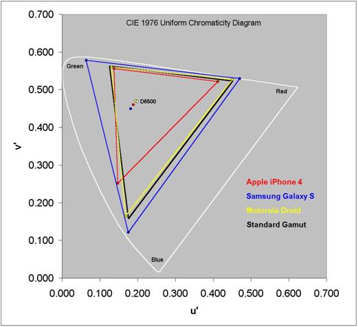
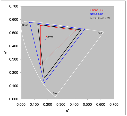
Early iPhones and iPod Touches (for the first 3–4 years) had much smaller color gamut than the recent ones, not matching any standard. They also did no color management whatsoever, with the result that colors and color relationships of basically all content were always fairly dramatically wrong [at least to my eyes, as an amateur photographer and amateur graphic designer who cares a lot about precise color rendering].
Some app authors and content producers put in the effort to understand and specifically target the iPhone display, e.g. by gamut mapping their images beforehand. But I would guess that “some” to be significantly less than 1%. (Though I suppose you might consider the exaggerated-color Instagram filters we’re discussing here to be one sort of gamut mapping, targeting the relatively muted display.)
At some point Apple started making all of their devices very precisely hit the sRGB spec, so even though iOS still did no active color management, that made things a lot better, at the expense of making it impossible to accurately target colors at all iPhones for a while because different models had different gamuts. If you go look up the historical tech specs and display teardowns for different iPhone generations, I’m sure you can figure out exactly which version was the first to be close to sRGB. [More recently, I believe they now also do some color management, though I haven’t really investigated this in a few years.]
The first couple iPad mini versions also had a smaller-than-sRGB color gamut and no color management (I have one of these). I’m not sure about the earliest full-sized iPads.
Of course, this is all still better than Android where there is extreme fragmentation and every display looks slightly different.
It wasn't perfect nor did it hit sRGB, but still pretty darn good for photos. As you say, they didn't color manage but they did a great job factory calibrating and selecting panels, and thus the lack of color management wasn't really an issue in practice, at least when designing apps. About 2 years after Instagram launched, the iPhone 5 came out which had sRGB.
The point still stands that the displays weren't the reason insta photos were filtered - it was driven by camera limitations and the culture / artistic sensibilities that Instagram imbued in the product.
That said, even when iOS didn’t do active color management (for performance reasons), there were some attempts to simulate it:
> Your content is matched to the sRGB color space on the authoring platform. This matching is not performed dynamically on the iOS device. Instead, it happens during authoring on your Mac OS X desktop.
[..]
> Targeted color management may also occur when you sync content to your mobile device. In fact, iTunes running on the desktop provides color management to the iOS targeted color space when you sync content from iPhoto to your iOS device.
(As you noted, there have also been more recent developments. Since last year there have been iOS devices which support the DCI-P3 gamut and use active color management; some of those devices also support “True Tone”, which adjusts the color mapping based on ambient light.)
Displays matter, but you may be missing the point. In short, low dynamic range means the display has less options to choose from. Better displays are very nice but they will always be limited by dynamic range and tone mapping. The problems of HDR are a pain in the ass, even for myself after working in film production for a decade and now doing CGI. But, when you do it all right (rarely can my projects afford to) it clicks. Games may never be able to in our lifetimes and the returns are diminishing. But, a great display with hacked dynamic range will hardly make a difference.


The same was true of early games. Gamers love the bright colors of World of Warcraft for instance because displays were bad, and it was easier to watch bright colors for hours on end while gaming. Even today my modern TV looks pretty bad in the sunlight. As much as I love the muted colors of Breath of the Wild I have to admit that without closing my curtains its really hard to tell what's going on if a sunbeam is hitting the TV.
I think as gamer's screens get better we will start to see a transition away from exaggerated brightness and a trend toward more realism, just like Instagram has transitioned largely from a platform that overcompensated for bad smartphone screens to a #nofilter style.