The point of most video games is to be distinct, not to look like reality. Furthermore, they use high-contrast to help distinguish game elements. Games are not movies.
Came looking for this. Unnatural contrast is good in games because it can help players distinguish different set pieces easier.
This is also why a lot of people prefer older FPS titles or games like TF2 used stylized profiles of the characters that stand out. In some games, you want interpretation of the game scene to be a challenge, but in most games, you want players to easily tell what they are looking at. Using high contrast / distinct models / distinct animations / color differentiation all help to achieve that.
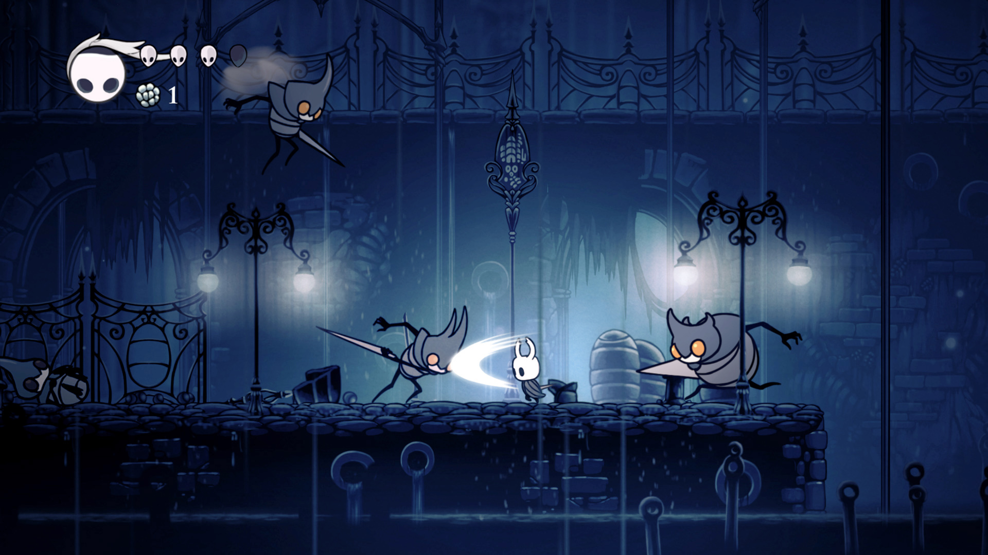
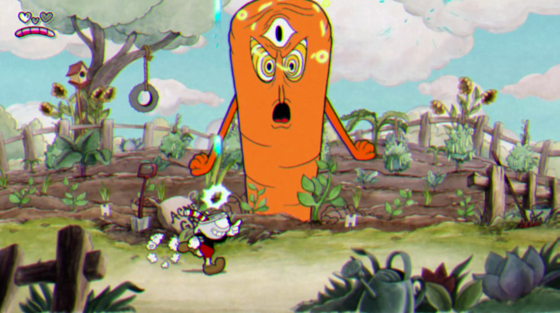
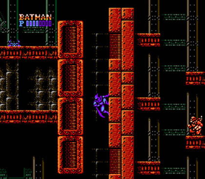
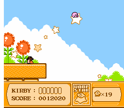
Photos and film need to be readable too. I think gaming culture has poor taste in art for historical reasons. Here's some games that were called "gorgeous":
I don't think it's fair to put Shovel Knight in your list.
Yacht Club Games tried really hard to recreate a NES aesthetics and constraints (limited color palette, sprites, etc...) with careful deviations when it is really necessary [1]. I don't think you'll find more aesthetically pleasant game in the NES library.
Hence my mention of historical reasons that are holding game aesthetics back. I think making good art requires criticizing your childhood tastes, not following them.
TF2 is very pretty and it’s clear that a lot of thought went into the color palettes and visual effects. The examples of bad effects in this article are the result of developers thinking “this is how games look”. I don’t think they got as far as planning how to guide the player’s attention.